Are you looking to make your social media images stand out and engage more of your followers?
Have you been struggling to get the attention you want from your posts?
With these 9 expert tips, you will learn how to enhance your social media images for maximum impact.
From color psychology, typography selection, and visual hierarchy, we cover everything you need to know about improving your visuals and driving better engagement on social media platforms.
We even share a list of the best tools for small business owners to create engaging images for social media.
Get started now and unlock the key to crafting amazing pictures that will wow your followers!

This post contains affiliate links. If you make a purchase using one of these links, I may receive a small commission. Please know that I only recommend products I have used and that I sincerely think will help your business.
1. Utilizing Color Psychology
Humans are visual beings, and color plays a significant role in setting the mood, creating an atmosphere, conveying emotions, and even evoking strong individual experiences.
In social media images, use colors strategically to guide your audience through a story or evoke specific emotions related to your brand.
Understanding Warm and Cool Colors
Warm and cool colors have different effects on people’s moods.
Warm colors like reds, oranges, and yellows tend to energize and draw attention, while cool hues such as blues, greens, and purples often evoke a tranquil atmosphere.
Since colors evoke emotions, it’s important to consider color combinations when designing your social media images.
Experiment with these hues when designing your social media images for maximum impact.

Experimenting with Color Combinations
To create visually appealing content that captures your audience’s attention, experiment with various color combinations.
Use complementary or analogous schemes based on the message you want to convey or the emotion you wish to evoke.
Use a free tool like the Adobe Color Wheel to select visually appealing color palettes.
Creating Contrast for Emphasis
- Bold Contrasts: Using contrasting shades can make certain elements of your image stand out more prominently. For example, pairing dark text against a light background makes it easier for viewers to read.
- Muted Tones: If you’re aiming for subtlety rather than drama, opt for muted tones that blend harmoniously together yet still provide enough distinction between components within visuals. This helps achieve balance without overpowering the senses.
Overall, understanding and utilizing color psychology in your social media images can greatly improve engagement and earn attention from potential customers.
Experiment with different colors, combinations, and contrasts to find the perfect palette for your brand’s visual content.
2. Mastering Lines and Composition
By manipulating lines, you can guide the viewer’s gaze and craft more engaging visuals.
By mastering techniques such as leading lines or the rule of thirds, you can create more dynamic social media images that capture attention.
Using Leading Lines Effectively
Leading lines are a powerful compositional tool in photography and design.
They draw the viewer’s eye toward specific points within an image, creating depth and interest.
To use leading lines effectively in your social media images, look for natural or man-made structures like roads, fences, buildings, or even shadows that can serve as guides for the audience’s attention.
Implementing The Rule Of Thirds
The rule of thirds is a fundamental principle in photography and design that suggests dividing an image into nine equal parts using two equally spaced horizontal lines intersected by two vertical ones.
Placing key elements along these intersections creates balance and improves engagement with your content marketing efforts on social media platforms like Facebook.
By mastering lines and composition, you can create visually pleasing images that draw viewers in.

3. Typography Tips for Impactful Social Media Images
Typography is an art form in itself. Using the perfect font can bring your social media images to life.
Choose fonts that complement each other while also reflecting your brand’s personality for maximum impact on viewers.
Pairing Complementary Fonts
Selecting fonts that work well together can enhance the overall design of your social media images.
A frequent practice is to combine a serif typeface with a sans-serif one, providing contrast and equilibrium between the two designs.
Websites like Font Pair offer suggestions on which typefaces go well together, making it easier for you to create visually appealing content.
Maintaining Readability at Different Sizes
The text in your images should be easy to read regardless of size or the platform used by your audience.
Test different font types and sizes and ensure they remain legible when scaled down or viewed on various devices, such as smartphones and tablets.
This helps improve engagement with users who access social media through multiple platforms.

Reflecting Brand Identity Through Typography Choices
- Serif: Serif fonts are considered more traditional and authoritative, making them suitable for businesses aiming to project professionalism or trustworthiness.
- Sans-serif: These modern-looking typefaces convey simplicity and clarity, ideal for tech companies or startups wanting a clean aesthetic.
- Cursive: Cursive scripts evoke elegance and creativity but may not be appropriate if readability is crucial due to their intricate nature.
By carefully selecting fonts that align with your brand’s personality, you can create social media images that effectively communicate your message and earn attention from potential customers.
Typography is an important part of creating impactful images and can be used to reflect brand identity.
4. The Power of Repetition and Consistency
Repetition is crucial when building a personal brand because it creates familiarity among followers.
By using consistent design elements like logos or branded color schemes across all platforms, people can instantly recognize content from you.
Brand Consistency Across Multiple Platforms
To establish a strong online presence, ensure that your visual content maintains a cohesive look throughout various social media channels such as Facebook, Instagram, and Twitter.
This includes using the same logo, fonts, colors, and overall style for each post.
Doing so will not only make your brand more memorable but also improve engagement with your audience.

Repeating Key Design Elements Within Posts
- Create templates: Designing reusable templates for different types of posts (e.g., quotes, announcements) helps maintain consistency while saving time on image creation. For pre-made templates that you can easily customize to fit your unique brand identity visit our Template Shop.
- Incorporate logos: Including your logo in every post strengthens brand recognition; just be sure to place it unobtrusively without distracting from the main message.
- Maintain color schemes: Stick to specific color palettes associated with your brand identity; use tools like Coolors.co or Adobe Color.
- Select appropriate typography: Your choice of fonts should align with your brand’s personality and remain consistent across all platforms.
By focusing on repetition and consistency in your social media images, you can enhance your social media images and earn attention from potential customers while reinforcing a cohesive brand identity.
This will ultimately help improve engagement rates and drive success for your content marketing efforts.
5. Playing with Negative Space
Negative space refers to areas around objects in an image that does not contain any information themselves but still contributes significantly towards overall aesthetics by providing a balance between various components present there.
A clever use of negative space can create mesmerizing visuals and help your social media images stand out from the crowd.
For instance, placing text over empty backgrounds allows viewers to focus solely on the message being conveyed without getting distracted due to unnecessary clutter.
Incorporating Negative Space into Your Designs
To incorporate negative space effectively, start by analyzing your image and identifying areas where you can remove or simplify elements without compromising the message.
This could mean removing unnecessary backgrounds, cropping tightly around a subject, or even using typography creatively to form shapes within empty spaces.
For example, Tang Yau Hoong a renowned artist known for his ingenious use of negative space in his artwork.

Creating Balance and Harmony in Images
- Size: Adjusting object sizes can help maintain balance while emphasizing important aspects of your design.
- Color: Using contrasting colors for foreground and background elements helps draw attention to specific parts of an image while maintaining harmony throughout.
- Symmetry: Incorporating symmetrical designs creates visual stability, which contributes positively to the viewer’s perception of the content being presented.
In addition to these techniques, consider experimenting with different layouts and compositions to find what works best for your individual preferences.
Remember, the ultimate goal here is to create engaging social media images capable of earning the audience’s attention and improving engagement rates across platforms like Facebook posts.
Don’t hesitate to push boundaries when it comes to exploring the possibilities available at your disposal.
6. Emphasizing Visual Hierarchy
Visual hierarchy helps guide the viewer’s eye through an image by prioritizing elements based on their importance.
Use size, color contrast, or positioning to emphasize key points and create a more engaging social media post.
Prioritizing elements with size variations can help your content stand out in the busy social media landscape, thus enhancing engagement.
Prioritizing Elements with Size Variations
Differentiating between various components within an image by adjusting their sizes is a great way to establish visual hierarchy.
For instance, you could make important text larger while keeping secondary information smaller.
This ensures that your audience’s attention is drawn toward crucial aspects first before moving on to less significant details.

Using Color Contrasts for Emphasis
Color contrasts play a vital role in creating emphasis within images as they help certain elements stand out from others around them.
By choosing contrasting colors for essential parts of your design, such as headlines or call-to-action buttons, you can draw viewers’ eyes directly to those areas and encourage interaction with your content.
Strategic Element Positioning
The placement of different objects within an image also contributes significantly to establishing visual hierarchy.
One popular technique mentioned earlier involves using the rule of thirds, which divides the frame into nine equal sections so that key elements are positioned along these lines or at their intersections for maximum impact.
To improve your skills, analyze some successful Facebook posts from businesses similar to yours and take note of how they utilize visual hierarchy techniques like size variations, color contrasts, and strategic element positioning.
Experiment with these techniques in your own social media images to improve engagement and earn attention from your target audience.

7. Experimenting with Textures and Patterns
Adding textures or patterns to your social media images can add depth, interest, and a sense of realism.
Incorporate them subtly while ensuring they don’t overpower other design components or detract from the main message.
Choosing Appropriate Textures for Brand Identity
Selecting the right texture is crucial in maintaining consistency with your brand’s image.
For instance, if you have an eco-friendly business, consider using natural textures, such as wood grain or leaf veins.
On the other hand, a tech company might opt for sleek metal surfaces or circuit board designs.
When choosing a texture, keep in mind that it should complement your overall visual content strategy rather than distract from it.

Layering Patterns Without Overwhelming Viewers
To avoid overloading your audience’s attention with too many competing elements in one image, follow these tips when incorporating patterns:
- Maintain balance: Use contrasting colors and sizes between patterned areas and solid spaces to create harmony within the composition.
- Simplify backgrounds: If you’re using bold patterns on text overlays or key visuals like logos/icons, make sure the background remains relatively simple so the focus stays intact. Check out sites like Unsplash for high-quality stock images that are perfect as subtle backdrops.
- Avoid clashing styles: Choose complementary pattern themes (e.g., geometric shapes paired together) instead of mixing multiple unrelated motifs, which could confuse viewers.
By experimenting with textures and patterns in your social media images, you can improve engagement by adding visual interest without sacrificing clarity or brand consistency.
Remember to choose appropriate textures that align with your brand identity and layer patterns carefully to avoid overwhelming your audience.

8. Leveraging Icons and Illustrations
Including icons, illustrations, or even emojis within your social media posts not only adds visual appeal but also aids in conveying complex ideas quickly.
By choosing relevant graphics that align well with your text content, you can ensure the overall meaning of your message remains intact and engaging for your audience.
Selecting Suitable Iconography for Various Topics
When it comes to picking out the right symbols and pictures for your social media visuals, think about how they link up with the issue in question.
For instance, if you’re discussing productivity tips in a Facebook post, using an icon representing a checklist or clock would be suitable.
There are numerous online resources available where you can find high-quality icons and illustrations, such as Canva.com or unDraw.

Combining Text-Based Information with Visuals Effectively
To create visually appealing and informative social media images, it’s essential to strike a balance between text-based information and visuals like icons or illustrations.
Here are some tips on how to do so:
- Maintain readability: Ensure that any accompanying text is easily readable alongside the chosen visuals by adjusting font size, color contrast, and spacing accordingly.
- Avoid clutter: Be mindful of overcrowding elements within an image; give each component enough space so viewers can focus on individual aspects without feeling overwhelmed.
- Create harmony: Select visuals that complement one another in terms of style and color palette to maintain a cohesive look throughout your content marketing efforts.
By leveraging icons and illustrations effectively, you can improve engagement on your social media posts while also delivering clear messages to your audience in an eye-catching manner.
This is especially important in today’s world, where social media images play a crucial role in earning attention and making people share your content.
9. Utilize Filters and Image Effects
Applying filters and image effects can greatly enhance the overall appearance of your social media images, making ordinary photos stand out amongst others.
However, it’s essential to ensure that their usage doesn’t compromise clarity since, ultimately, it’s about delivering clear messages to your followers.
Exploring Popular Filter Options Available Online
There are numerous online tools and platforms that offer a wide range of filter options for you to experiment with.
Some popular choices include Canva, Pixlr, and Adobe Photoshop.
These tools provide various filters such as vignettes, blurs, color adjustments, and more.
Experiment with various combinations to find the ideal look for your company’s visuals.

Balancing Effects Intensity
To make sure your social media images remain engaging without compromising on clarity or message delivery, follow these tips:
- Maintain readability: Ensure any text within the image remains legible even after applying filters or effects.
- Avoid overdoing it: While experimenting with multiple layers of effects might seem tempting, remember that less is often more when it comes to creating impactful visuals.
- Tailor intensity according to context: Depending on the mood or theme you want to convey in a particular post (e.g., fun vs professional), adjust effect intensities accordingly so they complement rather than detract from the main message.
Incorporating well-balanced filters and image effects into your social media images can help you improve engagement and earn attention from your target audience.
By experimenting with various options, you’ll be able to create visually appealing content that effectively conveys your brand’s message.

Best Tools for Creating Social Media Images
As a small business owner, it’s essential to leverage the power of tools to help you quickly and easily create eye-catching and engaging images for your posts.
Fortunately, there are some great tools out there to help you create stunning images for your social media accounts without spending a fortune or tons of time.
Two of the best tools for creating social media images are Canva and the Social Media Content Club.
Canva.com is an online platform and design editor that makes it easy to create beautiful visuals for social media.
With its extensive range of templates, fonts, illustrations, and photos, Canva makes it simple to customize graphics of all kinds – from banners and posters to presentations and logos.
The platform also offers various image effects, such as filters, frames, and color adjustments, allowing users to create stunning visuals with minimal effort.
Canva’s intuitive drag-and-drop interface allows anyone to create eye-catching designs in minutes, regardless of their level of design experience.
Best of all, the platform is free to use and offers both a web version as well as mobile apps for iOS and Android, making it an ideal choice for social media image creation.
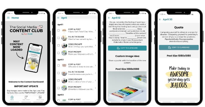
The Social Media Content Club is the best resource for marketers and entrepreneurs looking to maximize the impact of their social media marketing efforts.
Inside the Content Club, members get access to 4 types of daily content, a library of professionally designed images, engaging captions, and an AI post generator.
Content Club members have reported it saves them up to 10 hours a week.
Katherine tried it and said, “I tried this for 1 day before buying a yearly subscription. What I love is that most pressure is gone!! No more agonizing blank vapid stares at my phone wondering what to do for social media today.”
Click here to start a free 7-day trial of the Social Media Content Club.

Conclusion
Enhancing social media images is crucial for small business owners and entrepreneurs to earn their audience’s attention and improve engagement.
Utilizing color psychology, mastering lines and composition, typography tips, emphasizing visual hierarchy, playing with negative space, experimenting with textures and patterns, leveraging icons and illustrations as well as utilizing filters and image effects are all essential elements in creating impactful social media visuals.
By implementing these design techniques effectively into your social media posts, you can create a consistent brand identity across multiple platforms while also grabbing the viewer’s attention.
Enhancing your social media images will help you stand out from the crowd on social media platforms.


